
From Print to Product
Clal Design System
Evolving Clal’s rebranded identity into a scalable digital system across web and app.
Overview
Following Clal’s brand refresh, I translated the new visual language into a scalable digital system.
Rather than a static guideline, the system evolved through real product needs - adapting across web and app environments while maintaining consistency, usability, and flexibility.
01 Colors
The color palette expands Clal’s refreshed brand system for digital use. Darker “plus” shades are used for interactive states such as hover and pressed, while lighter “minus” shades support backgrounds and graphics. This creates a flexible digital palette that maintains brand consistency while improving readability and usability.

Primary colors
+20
#3D6CED
+30
#293768
Secondary colors
+10
#B0FFAE
-20
-40
-70
+10
#D2E1FF
-20
-40
-60
#FFF2EB
-30
-60
#F8FFD2
-30
-60

02 Spacing System
The layout is based on an 8pt spacing system, where spacing values are consistently applied across components.
Different spacing levels define hierarchy and relationships between elements — from small gaps within content to larger section separations.
Spacing Scale

Spacing in Use

03 Elevation System
The system adapts across platforms: the app uses elevation and shadows to create depth, while the website relies on surfaces, spacing, and layout to define hierarchy.
Surface-based hierarchy (Web)

Depth-based hierarchy (App)


04 Buttons
Buttons were designed to maintain consistent interaction patterns across platforms, while adapting their visual hierarchy through color, context, and layout.


Input Types


Field States
Web
App
Default


Focus


Error


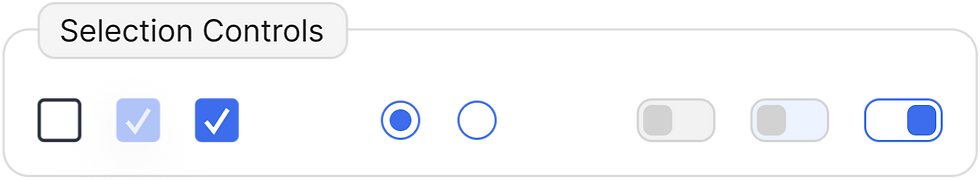
05 Form & Input System
The form system maintains consistent behavior across all input components, including states such as default, focus, and error. While interaction patterns remain unified, the visual structure adapts between web and mobile — optimizing for layout, spacing, and context of use.
More Works
View Alll

Dynamic page components
