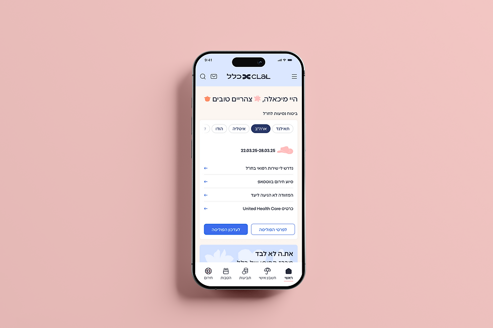
Dynamic Pages
A flexible component system for Clal’s content managed pages.
I designed a responsive component library that helps Clal’s content teams build dynamic pages faster, while keeping the experience consistent, branded, and easy to maintain.
Project Context
Clal’s content and marketing teams needed a more flexible way to build dynamic pages inside the CMS, without creating a new custom layout for every page.
Role
UX/UI Designer
Platform
Responsive Web
Focus
Reusable Components, CMS Flexibility, Responsive Design
01 Starting Point
The real problem was not only visual inconsistency, it was workflow.
Before the component library, dynamic pages were built with inconsistent layouts and limited reusable sections. Each page required design attention, which made it harder for content teams to create new pages quickly and keep the website visually consistent.
Examples from the previous system


Before: limited components, too much manual decision-making

Although components already existed, they were not structured as a flexible system. Editors still had to rely on manual layout decisions, making the workflow harder to scale and maintain.
02 Research & Insights
The goal was not only to apply Clal’s refreshed brand language, but to improve how dynamic pages were built and maintained. After reviewing existing pages and working closely with the content team, I identified three recurring needs.
Three recurring needs
Brand implementation
Translate the new brand language into reusable digital components.
Component structure
Create clearer content hierarchy and more predictable layouts.
Design rules
Define consistent rules for spacing, typography, and behavior.
03 System Approach
I translated recurring content patterns into reusable components with clear rules, responsive behavior, and editor-controlled variations — allowing the content team to build flexible pages independently while maintaining brand consistency.
Responsive behavior across breakpoints
Each component was designed across four key breakpoints , 1920, 1440, 774, and 360, to keep the layout consistent on every screen size.

04 Component Library
These insights became the foundation for a modular component library — built around the content team’s real needs: flexible sections, editable content, controlled visual variations, and responsive layouts that could support different page types independently.
Reusable structure · Editor flexibility · Responsive behavior · Brand consistency
Contact Form Strip
A reusable lead generation component for placing contact forms inside different page types, while keeping the structure clear, familiar, and easy to complete.
Editor controls:
Editable title · Editable field labels and helper text · White, cream, or light blue background

Expandable Info Card
A reusable card component for content-heavy items with multiple links.
It was designed to let editors add richer content without creating uneven card heights or breaking the rhythm of the page.
Before - Uneven link lists
Cards with different numbers of links created uneven heights and made the layout harder to scan.

After - Expandable links
The card shows a limited number of links by default, with an expandable state for additional links.

Editor controls:
Editable title · Optional image · Optional body text · Up to 6 links · Expandable link state · Green, yellow, light blue, or cream card color · Grid or horizontal scroll layout

FAQ Section
A reusable accordion component for long-form informational content.
It helps editors organize questions and answers in a clear, scannable structure while keeping the interaction consistent across the site.
Editor controls:
Editable title and optional subtitle · Editable questions and answers · One-item-open behavior · White or cream background


Icon Strip
A supporting content section for short messages, benefits, or service highlights.
It gives editors a simple way to add visual rhythm to long pages while keeping icons and silhouettes visually consistent.
Editor controls:
Icon or silhouette upload · Fixed 80×80 visual frame · Horizontal or vertical layout · Content alignment · Background color selection

Video Carousel
A reusable media component for presenting multiple videos inside one structured section.
It allows editors to add rich media to content pages without designing a custom video layout for every use case.
Editor controls:
Editable title and optional subtitle · Thumbnail upload · Main video and preview state · Side navigation · White, light blue, or cream background

Basic Info Card
A reusable card component for presenting services, articles, or related information in a clean, scannable way, while helping editors build structured content areas that stay balanced across screen sizes.
Editor controls:
Editable title and body text · Optional image · Optional link · Editable link label and URL · Cream, light blue, yellow, or green card color · Grid or horizontal scroll layout

Text Banner
A branded content strip designed to highlight key messages, create a visual pause within long pages, and give editors a flexible way to present marketing content without a custom layout.
Editor controls:
Editable title · Optional subtitle · Typography style · Right or center alignment · White, cream, light blue, or dark blue background · Optional background image


Hero Banner
A flexible opening component for marketing and content pages, designed to support different hero variations while keeping hierarchy, rhythm, and CTA structure consistent.
Editor controls:
Headline style selection · Image or Lottie upload · Dark blue, light blue, or cream background · No CTA, primary CTA, or primary + secondary CTA · Bullet list or numbered list

05 Outcome
The component library gave Clal’s content team a clearer and more scalable way to build dynamic pages independently. Instead of treating each page as a custom design task, the team now had reusable building blocks with defined content options, visual rules, and responsive behavior.
More Works

Design System

ForkCheck