
Insurance Cards Redesign
Unifying hierarchy & improving scanability in the home screen
01 Overview
As part of Clal’s mobile app redesign, I focused on improving the structure of the insurance cards on the home screen.
These cards are one of the most prominent elements in the app: they surface key policy information, business-driven actions, and user-specific content.
The challenge was to support users with multiple active policies without creating a long, repetitive, and difficult-to-scan layout.
The goal was to create a clearer hierarchy, reduce visual clutter, and align the experience with Clal’s refreshed digital language.
02 The Problem
When users had multiple active policies of the same type — for example, several trips or multiple vehicles — the cards appeared one after another in a long vertical stack.
This made the home screen feel heavy and repetitive. Related policies were not clearly grouped, and content further down the screen was pushed out of view.
The challenge was to reduce clutter and create a clearer hierarchy, without removing information users still needed to access.
Current state - repeated cards
02 The Problem
When users had multiple active policies of the same type — for example, several trips or multiple vehicles — the cards appeared one after another in a long vertical stack.
This made the home screen feel heavy and repetitive. Related policies were not clearly grouped, and content further down the screen was pushed out of view.
The challenge was to reduce clutter and create a clearer hierarchy, without removing information users still needed to access.

03 Insight
Policies from the same category were shown as separate cards, which created repetition, weakened hierarchy, and made the home screen harder to scan.
The key insight was that these cards needed to behave as a unified group — not as repeated standalone elements.
The solution wasn’t to remove content, but to create a clearer grouping structure.
04 First Exploration
Exploring horizontal scroll to reduce vertical clutter
To reduce vertical clutter, I explored a horizontal scroll pattern between cards from the same category.
While this shortened the page, it exposed structural issues that made the layout feel less stable and harder to scale.

Why it didn’t work?
01
Broken grid alignment
02
Inconsistent card heights
03
Less stable layout
05 Design Direction
Turning brand bubbles into functional tabs
The exploration clarified that the solution wasn’t about changing the scroll direction — it was about changing the structure.
The branding agency introduced the bubbles as a visual element for section titles within the printed brand language. In digital products, however, the bubbles needed more than an aesthetic role.
Their strong visual presence created an opportunity to turn them into functional tabs — helping users switch between related policies while keeping the layout stable and aligned with Clal’s visual language.
This allowed multiple policies from the same category to behave as one grouped area, instead of repeated standalone cards.
Reference — familiar tab behavior
A familiar tab pattern helped validate the direction: rounded elements can support clear, tappable navigation when their role is explicit.

06 Final Solution
A grouped card structure with clear tab navigation
The final solution groups related policies into one structured area, using tabs to let users switch between policies within the same category.
This reduced repetition, kept the screen shorter and more organized, and gave the brand bubbles a clear functional role.
The structure stays consistent while the card content adapts to each policy state.

Before Trip
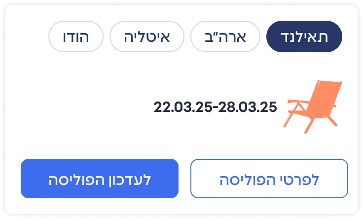
During Trip

After Trip

One stable structure, multiple adaptive states.
More Works
View Alll

Design System
