
From Print to Product
Clal Design System
Translating Clal’s refreshed brand language into a scalable digital design system for web and mobile app experiences.
Project Context
As part of Clal’s digital work, I helped translate the refreshed brand language into practical UI foundations for both web and mobile app experiences. The goal was to create a consistent system that could support colors, spacing, elevation, buttons, and form components across different digital products.
Role
UX/UI Designer
Platform
Web & Mobile App
Focus
Design System, Brand Translation, UI Foundations
01 Colors
The color system was created to translate Clal’s refreshed brand language into digital use, balancing the new visual identity with accessibility, hierarchy, and practical UI needs across web and mobile app screens.

Primary colors
+20
#3D6CED
+30
#293768
Secondary colors
+10
#B0FFAE
-20
-40
-70
+10
#D2E1FF
-20
-40
-60
#FFF2EB
-30
-60
#F8FFD2
-30
-60

02 Spacing System
The spacing system was built around consistent layout rules, helping screens feel organized, readable, and aligned across different content types and breakpoints.
Spacing Scale

Spacing in Use

03 Elevation System
The elevation system defined how cards, popups, and layered surfaces should behave, creating a consistent sense of depth without making the interface feel heavy.
Surface-based hierarchy (Web)

Depth-based hierarchy (App)


04 Buttons
The button system defines clear action hierarchy across web and mobile app interfaces, with consistent styles for primary, secondary, disabled, and contextual actions.


Input Types


Field States
Web
App
Default


Focus


Error


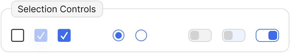
05 Form & Input System
The button system defines clear action hierarchy across web and mobile app interfaces, with consistent styles for primary, secondary, disabled, and contextual actions.
06 Outcome
The design system created a clearer foundation for Clal’s digital products, making UI decisions more consistent across web and mobile app experiences. It helped connect the refreshed brand language with practical product components that could be reused across different screens and flows.
More Works

ForkCheck
Insurance Cards
