
Insurance Cards
Redesigning Clal’s mobile insurance-card structure to improve hierarchy, scanning, and scalability.
Project Context
Clal’s mobile app redesign was created in collaboration with an external design studio. As the in-house UX/UI designer, I was involved throughout the process, guiding product and visual decisions, designing specific app areas, and helping align the experience with Clal’s digital needs.
This case study focuses on one specific problem I identified and solved independently: improving the insurance-card structure on the home screen.
Role
In-house UX/UI Designer
Platform
Mobile App
Focus
Card Hierarchy, Navigation, Scalability
01 Overview
This case study focuses on the insurance-card area of Clal’s mobile app home screen. The goal was to create a clearer, more scalable structure for users with multiple active policies, while keeping the experience aligned with Clal’s refreshed digital language.
02 The Problem
Users with multiple active policies saw repeated card layouts on the home screen, creating a long and visually heavy experience.
This made it harder to scan, compare, and understand insurance status at a glance especially when several cards belonged to the same policy category.
02 The Problem
When users had multiple active policies of the same type — for example, several trips or multiple vehicles — the cards appeared one after another in a long vertical stack.
This made the home screen feel heavy and repetitive. Related policies were not clearly grouped, and content further down the screen was pushed out of view.
The challenge was to reduce clutter and create a clearer hierarchy, without removing information users still needed to access.
Current state - repeated cards

03 Insight
The main insight was that the issue was not the amount of information, but the way it was grouped. Users needed a clearer structure that would reduce repetition, keep related cards together, and make the home screen easier to scan.
The solution wasn’t to remove content, but to create a clearer grouping structure.
04 First Exploration
Exploring horizontal scroll as a way to reduce vertical clutter
I first explored a horizontal-scroll pattern, allowing users to swipe between cards from the same category. While it reduced vertical length, it introduced a new usability issue: weaker visibility, less stable hierarchy, and lower discoverability of additional cards.

Why it didn’t work?
01
Broken grid alignment
02
Inconsistent card heights
03
Less stable layout
05 Design Direction
Turning visual brand elements into functional navigation
The final direction was to turn repeated insurance cards into a functional navigation pattern. Instead of showing every card as a separate block, related cards were grouped together, allowing users to move between policy states while keeping the home screen shorter, clearer, and easier to scan.
Reference- familiar tab behavior
A familiar tab pattern helped validate the direction: rounded elements can support clear, tappable navigation when their role is explicit.

06 Final Solution
A grouped card structure with clear tab navigation
The final solution introduced grouped card sections with internal navigation. This allowed users to view related insurance items within the same category, while keeping the home screen visually lighter and easier to understand.

Before Trip
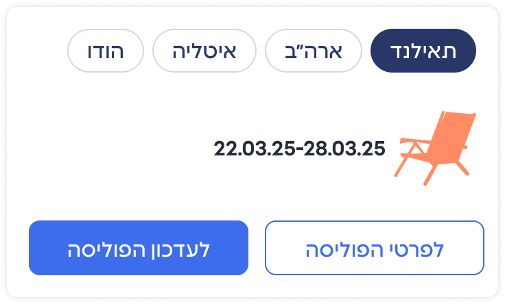
During Trip

After Trip

One stable structure, multiple adaptive states.
07 Outcome
The new card structure reduced visual repetition on the home screen and made it easier for users to understand their insurance status at a glance. It created a more scalable pattern for future policy types while keeping the app experience cleaner and more consistent.
More Works

Design System

ForkCheck
